 BG/ENConsultation
SS Williams & Co – logo and identity for an accounting firm
‹ All projects
PROJECT · LOGO · IDENTITY · ACCOUNTING FIRM
The project
A hexagon of two letters.
The SS Williams & Co logo combines S and W in one mark to convey reliability and stability
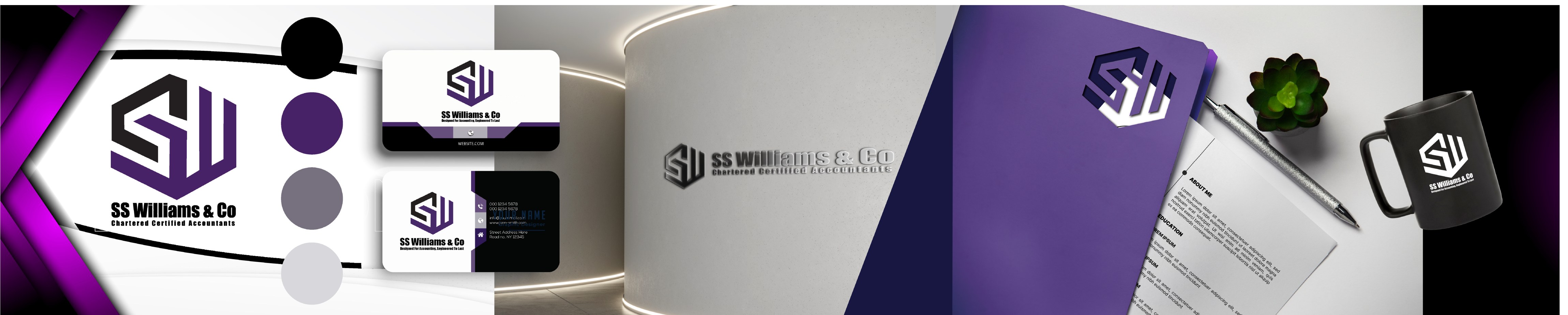
01ShapeA hexagon in which the letters S and W come together: stable and orderly like an accounting ledger.
02ColourBlack for the S and purple for the W, with the light gaps between them separating them like rows in a table.
03Tagline„Designed For Accounting, Engineered To Last“. A tagline created by us to convey the brand’s message to the client.
The colours
Black, purple and grey.
Four colours that give the office a strict and modern look.
Black#231F20
Purple#4A2869
Grey-purple#7C7788
Light grey#D3D2D8
On materials
The different materials
Examples of visualisation in a real environment.

Need a serious brand?
Tell us about your business and we’ll create an identity that inspires trust.