 BG/ENConsultation
L’Éclat Macarons – logo and identity for a macaron brand
‹ All projects L’Éclat MacaronsPROJECT · LOGO · IDENTITY · PACKAGING
The project
Two letters, one curve.
A brand for French confectionery with a refined, warm character. Two monograms, a palette that evokes chocolate and cream, and packaging that is easy to remember.
01MonogramThe letters L and M share common lines, and a soft curve remains in the middle.
02Second versionA symmetrical, more ornate monogram with curls, for more formal materials.
03Warm coloursA colour palette that recalls chocolate and vanilla
The monograms
Two faces of the brand.
Main logo and mark for print materials such as boxes and ribbons.
The colours
Chocolate, caramel and cream.
A palette that feels like a flavour.
Dark#211B1A
Cocoa#7C5546
Caramel#B0927C
Cream#E9DAC7
On packaging
Boxes, labels and cards.
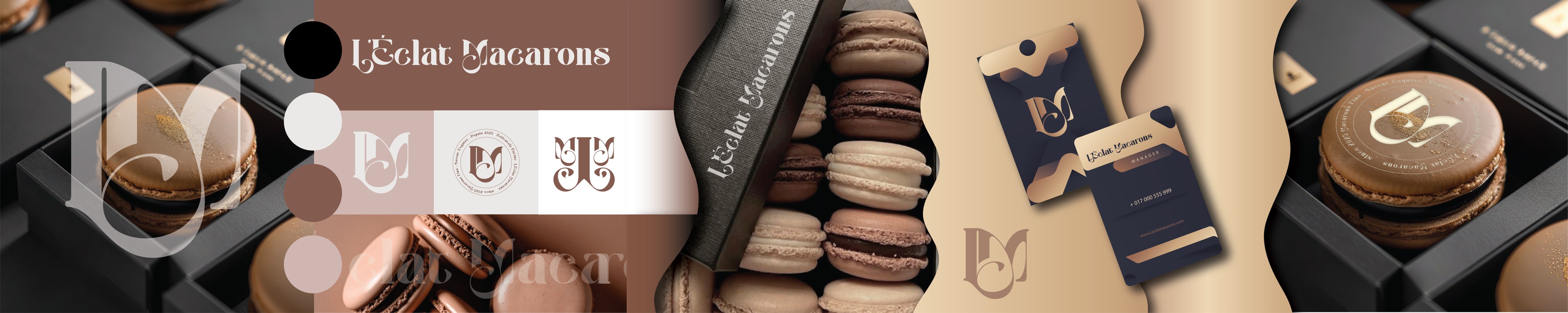
Visualisation of the logo and brand in a real environment.

Got a tasty product?
Tell us about it and we’ll create packaging people want.