 BG/ENConsultation
AQUA CUT – label design for Holistiq Nutrition
‹ All projectsPROJECT · LABEL · HOLISTIQ NUTRITION
Clean. Fresh. Reliable.
The brief
What the client wanted.
A label for a new Holistiq Nutrition product. It had to look clean, fresh and reliable, while remaining part of the brand’s series.
01CleanOrderly, with plenty of air and a clear order of information.
02FreshA water theme and a colour that stands out on the shelf.
03ReliableLegible text and a serious tone, like a pharmacy product.
The series
Together, but different.
Holistiq already has its own style: a black label and gold details. AQUA CUT keeps it, but has its own colour.
Gold is the signature
Black label, gold logo and icons: Holistiq is recognised at first glance.
Turquoise is the character
AQUA CUT has a water theme, which is why we introduced the turquoise element.
The detail
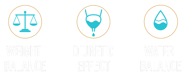
Three icons, one water.
Three icons in one style, drawn to be read instantly: Weight Balance, Diuretic Effect and Water Balance.
The label
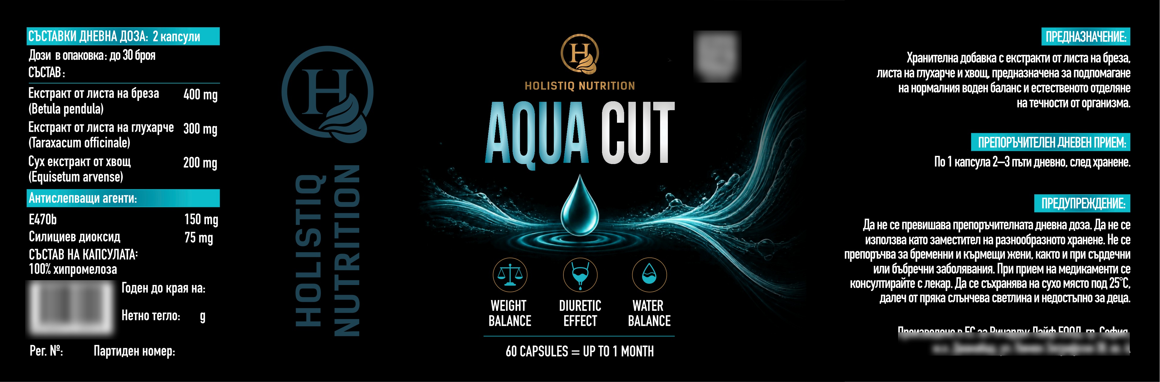
The whole label, unfolded.
Size 50×160 mm, prepared for print. The QR code, barcode and manufacturer details are not shown here.
On the jar
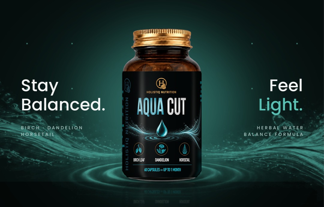
This is how it looks on the shelf.
Dark glass, a gold cap and a label that is recognisable from afar.
Have a product? We’ll make a label for it.
Tell us about the product and we’ll suggest how it should look on the shelf.